


 created by
 L. Valerius
 reviewed by
K. Monroe
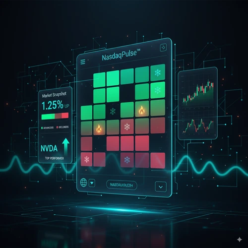
NasdaqPulse™ Interactive Stock Heatmap
Market Status
Market Snapshot
Advancers vs. Decliners
Interactive Heatmap
Select a Market: Use the dropdown to switch between curated stock lists like the Nasdaq 100 or specific sectors.
Volatility Icons: The 🔥 icon indicates unusually high daily trading range, while the ❄️ icon indicates an unusually quiet day. These highlight stocks with abnormal activity based on their 30-day average.
Click any stock to load its detailed daily chart below.
CALCULATIONS
- Top/Worse Performer: This is not simply the stock with the highest or lowest percentage change. It measures which stock is performing the best (or worst) *relative to the list's average performance*. This highlights true outliers.
- Volatility Icons: The 🔥 and ❄️ icons appear when a stock's daily trading range (High minus Low) is significantly greater than (🔥) or less than (❄️) its 30-day average trading range. This helps spot abnormal activity.
DATA SOURCE
All data is provided by a third-party financial data supplier and may be delayed by up to 15 minutes. It is intended for informational and educational purposes only.
Chart
Live Market Tickers


How to Use the NasdaqPulse™ Dashboard
This isn't a static heatmap; it's a dynamic and interactive dashboard. It's built to give you a multi-layered view of market action so you can find unique trading ideas. Here’s a quick guide to its components:
- Select Your Universe: Start with the Market dropdown. Instead of a single, fixed index, you can focus on curated lists like the
Nasdaq 100,Semiconductors, orHigh Beta Movers. Your selection powers the entire dashboard. - Read the Vitals: The Market Snapshot provides the core data. You see the average performance of your chosen list, the number of stocks advancing versus declining (market breadth), and critically, the true Top and Worse Performers based on relative strength.
- Scan the Heatmap: This is your visual guide. Each block is a stock, colored by its daily performance. Use the filters to sort by strength or view only advancers or decliners. Watch for the
🔥and❄️icons—they flag stocks with unusually high or low daily volatility. - Drill Down to a Chart: See a stock you want to analyze? Click any block in the heatmap, a vital card, or the ticker to instantly load a detailed TradingView chart below. Go from a high-level view to deep analysis in one click.
A Real-World Example: Spotting Relative Strength
Imagine you load the dashboard and select the "Semiconductors" list from the dropdown. The List Performance card shows the entire sector is down -1.50%. The breadth meter confirms this, with most stocks declining.
However, the Top Performer card highlights stock XYZ with a relative performance of +2.50%. You look at its block on the heatmap and see it's green in a sea of red. This is the key insight. Stock XYZ might only be up 1.00% on the day (-1.50% list average + 2.50% relative performance), but its ability to stay positive demonstrates significant relative strength.
The tool's unique calculation automatically surfaces this outlier, which would be missed in a standard heatmap sorted by absolute performance. This gives you a powerful, data-driven reason to investigate that stock for resilience.
The Logic Behind the Tool: Beyond Simple Percentages
This dashboard goes deeper than most heatmaps. Its value comes from its proprietary calculations.
- True Outlier Detection: The Top/Worse Performer is not just the biggest gainer or loser. It's calculated as
Stock % Change - List Average % Change. This powerful formula finds stocks that are truly outperforming or underperforming their peer group, highlighting relative strength or weakness. - Volatility Flags: The
🔥and❄️icons are not random. They appear when a stock's current daily trading range (High - Low) is significantly larger (🔥) or smaller (❄️) than its 30-day average. This helps you spot abnormal intraday activity, often driven by news or unusual volume. - Focused Market Breadth: The Advancers vs. Decliners meter is a classic indicator of market health, a concept even financial regulators like FINRA view as important. Here, it is applied directly to the specific list you've selected, giving you a focused view of conviction within a sector or theme.
Frequently Asked Questions (FAQ)
How is the "Top Performer" calculated?
It identifies the stock with the largest positive deviation from the list's average performance. The formula is Stock % Change - List Average % Change. This method is designed to find true relative strength, not just the stock with the highest raw percentage gain.
What do the 🔥 and ❄️ icons mean?
These are volatility indicators. The fire icon (🔥) signals that the stock's trading range for the day is unusually high compared to its 30-day average. The snowflake icon (❄️) signals an unusually quiet day with a narrow trading range. They help you spot abnormal activity.
How do I change the index shown in the heatmap?
You can change the active stock list using the "Market" dropdown menu in the "Market Snapshot" section. This will update the entire dashboard, including the vitals, heatmap, and ticker, to reflect your chosen list, whether it's the Nasdaq 100, Semiconductors, or another option.
Is the data real-time?
As stated in the disclaimer, all financial data is provided by a third-party supplier and may be delayed by up to 15 minutes. The dashboard is intended for informational and educational purposes, not for making real-time trading decisions without independent verification.

Join the Discussion
What interesting outliers are you finding with the dashboard today? Which list is showing the most relative strength or weakness? Share your analysis in the comments below!